Plotting
Contents
Plotting#
Plotting a property#
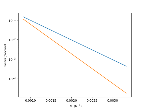
HTM has a plotting module for visualising the temperature dependence of a property:
import h_transport_materials as htm
from h_transport_materials.plotting import plot
import matplotlib.pyplot as plt

D_1 = htm.Diffusivity(
   D_0=1 * htm.ureg.m**2 * htm.ureg.s**-1,
   E_D=0.2* htm.ureg.eV * htm.ureg.particle**-1,
)

D_2 = htm.Diffusivity(
   D_0=2 * htm.ureg.m**2 * htm.ureg.s**-1,
   E_D=0.3* htm.ureg.eV * htm.ureg.particle**-1,
)

plot(D_1)
plot(D_2)

plt.yscale("log")
plt.show()
(Source code, png, hires.png, pdf)
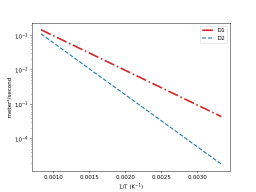
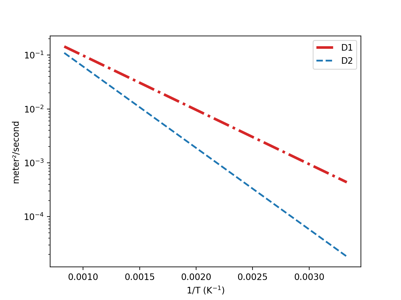
The matplotlib line parameters can be modified:
import h_transport_materials as htm
from h_transport_materials.plotting import plot
import matplotlib.pyplot as plt

D_1 = htm.Diffusivity(
   D_0=1 * htm.ureg.m**2 * htm.ureg.s**-1,
   E_D=0.2* htm.ureg.eV * htm.ureg.particle**-1,
)

D_2 = htm.Diffusivity(
   D_0=2 * htm.ureg.m**2 * htm.ureg.s**-1,
   E_D=0.3* htm.ureg.eV * htm.ureg.particle**-1,
)

plot(D_1, linestyle="-.", color="tab:red", linewidth=3, label="D1")
plot(D_2, linestyle="dashed", color="tab:blue", linewidth=2, label="D2")

plt.yscale("log")
plt.legend()
plt.show()
(Source code, png, hires.png, pdf)

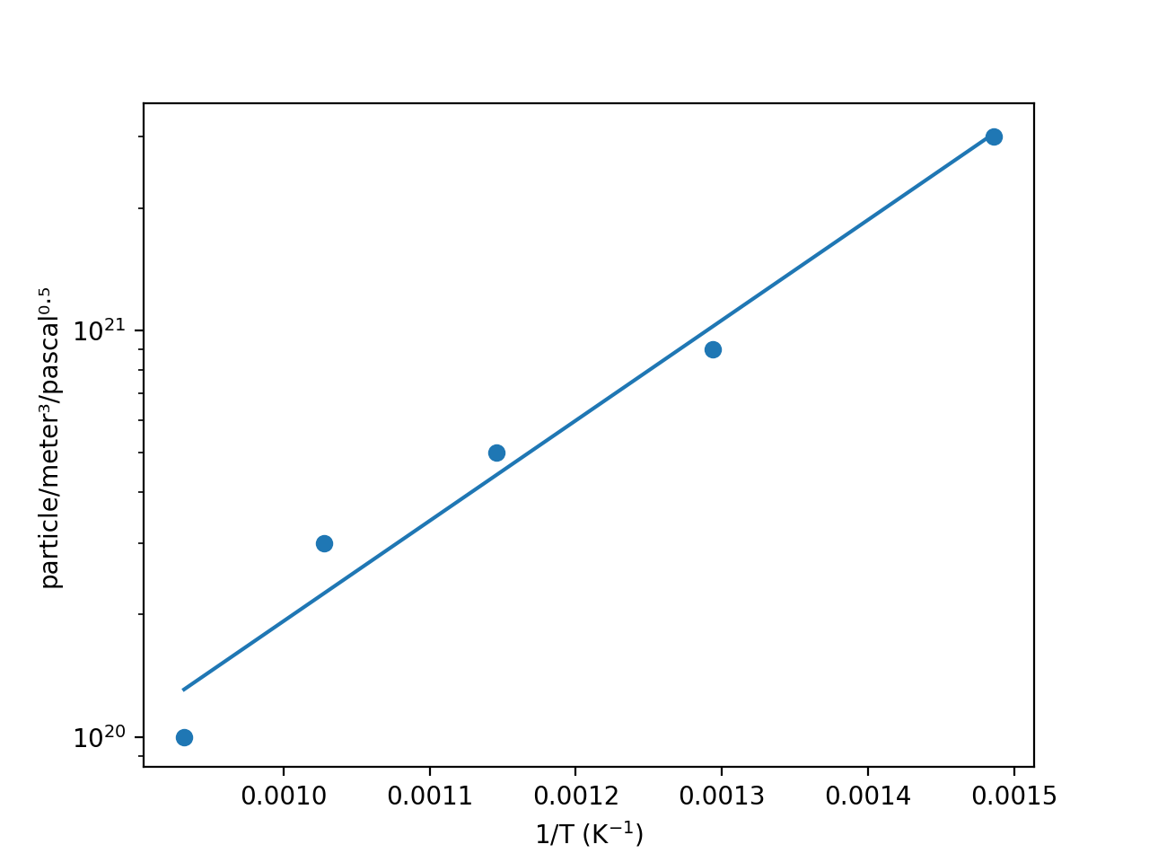
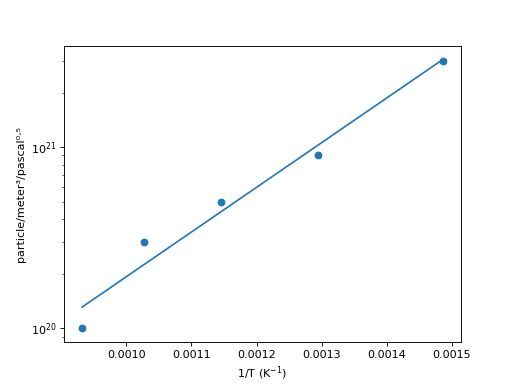
Plotting with experimental points#
When the (T,y) data is given with the attributes .data_T and .data_y, the experimental points are also plotted:
import h_transport_materials as htm
from h_transport_materials.plotting import plot
import matplotlib.pyplot as plt

S = htm.Solubility(
   data_T=[673, 773, 873, 973, 1073] * htm.ureg.K,
   data_y=[3e+21, 9e+20, 5e+20, 3e+20, 1e+20]
   * htm.ureg.particle
   * htm.ureg.m**-3
   * htm.ureg.Pa**-0.5,
)

plot(S)

plt.yscale("log")
plt.show()
(Source code, png, hires.png, pdf)
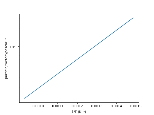
In order to hide the experimental points, simply call:
import h_transport_materials as htm
from h_transport_materials.plotting import plot
import matplotlib.pyplot as plt

S = htm.Solubility(
   data_T=[673, 773, 873, 973, 1073] * htm.ureg.K,
   data_y=[3e+21, 9e+20, 5e+20, 3e+20, 1e+20]
   * htm.ureg.particle
   * htm.ureg.m**-3
   * htm.ureg.Pa**-0.5,
)

plot(S, show_datapoints=False)

plt.yscale("log")
plt.show()
(Source code, png, hires.png, pdf)
Plotting groups of properties#
Alternatively, several properties can be plotted at once when part of a PropertiesGroup():
import h_transport_materials as htm
from h_transport_materials.plotting import plot
import matplotlib.pyplot as plt

D_1 = htm.Diffusivity(
   D_0=1 * htm.ureg.m**2 * htm.ureg.s**-1,
   E_D=0.2* htm.ureg.eV * htm.ureg.particle**-1,
)

D_2 = htm.Diffusivity(
   D_0=2 * htm.ureg.m**2 * htm.ureg.s**-1,
   E_D=0.3* htm.ureg.eV * htm.ureg.particle**-1,
)

plot(htm.PropertiesGroup([D_1, D_2]))

plt.yscale("log")
plt.show()
(Source code, png, hires.png, pdf)

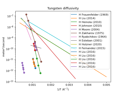
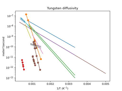
This means the entire database can be plotted in a few lines of code, here’s an example for diffusivities:
import h_transport_materials as htm
from h_transport_materials.plotting import plot
import matplotlib.pyplot as plt

# filter only tungsten and H
diffusivities = htm.diffusivities.filter(material="tungsten").filter(isotope="h")

plot(diffusivities)

plt.title("Tungsten diffusivity")
plt.yscale("log")
plt.legend()
plt.show()
(Source code, png, hires.png, pdf)

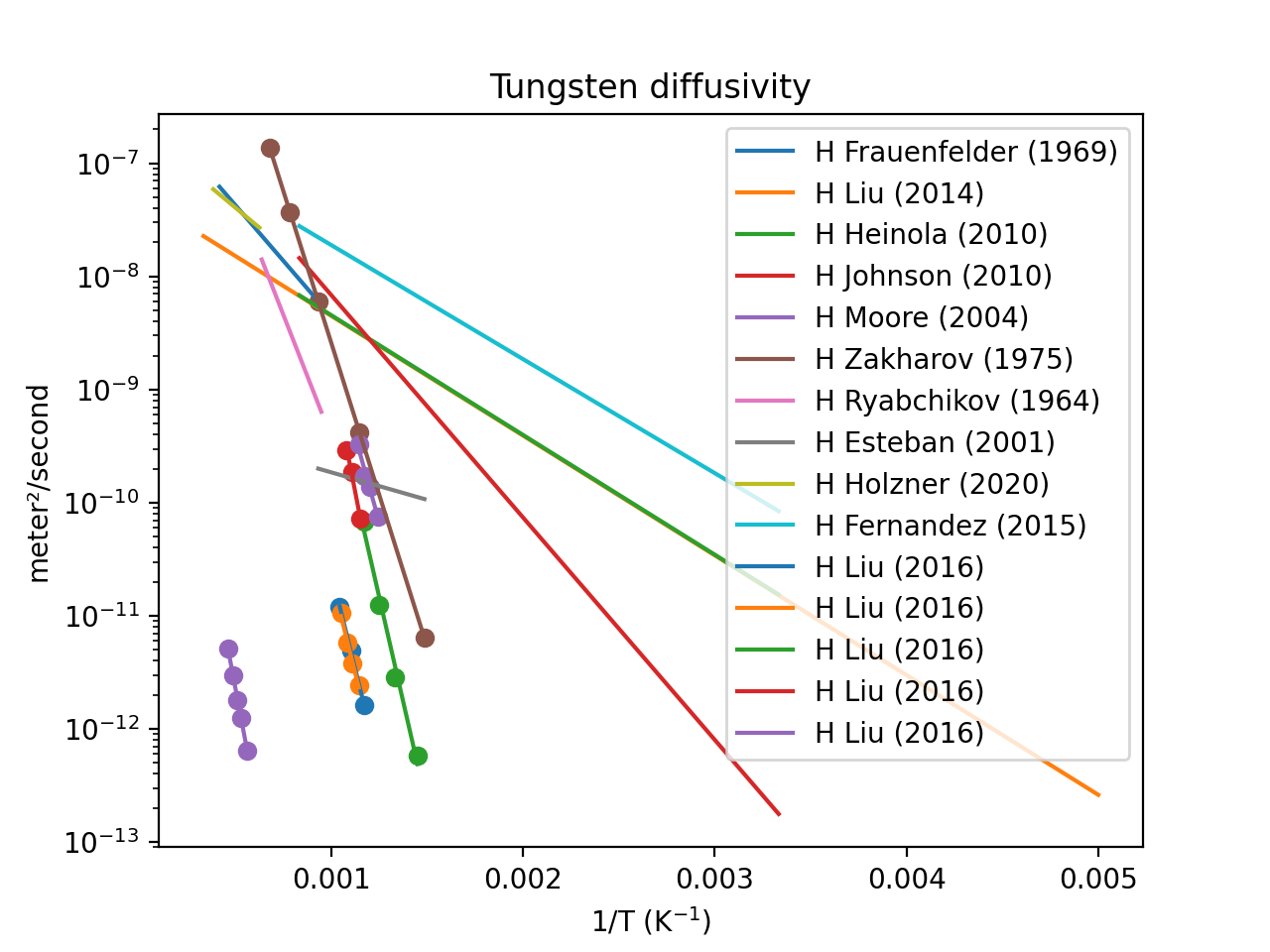
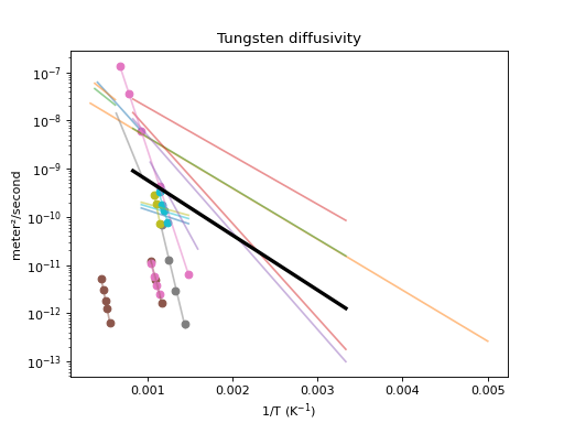
Calculate the mean value and plot it too:
import h_transport_materials as htm
from h_transport_materials.plotting import plot
import matplotlib.pyplot as plt

# filter only tungsten and H
diffusivities = htm.diffusivities.filter(material="tungsten")

plot(diffusivities, alpha=0.5)
plot(diffusivities.mean(), color="black", linewidth=3)

plt.title("Tungsten diffusivity")
plt.yscale("log")
plt.show()
(Source code, png, hires.png, pdf)

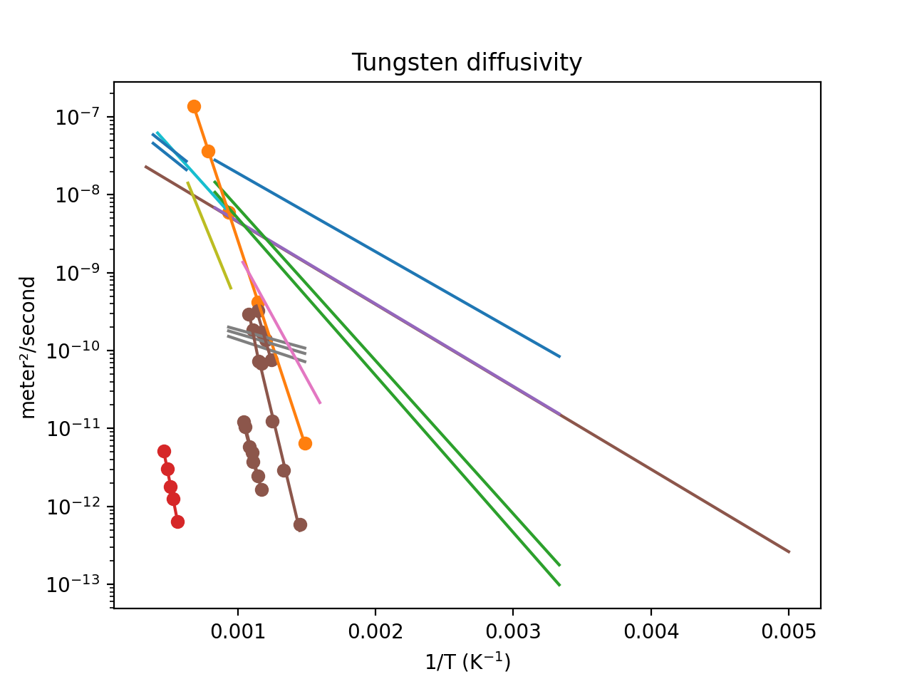
The properties can be coloured according to different attributes like materials, author…
import h_transport_materials as htm
from h_transport_materials.plotting import plot
import matplotlib.pyplot as plt

# filter only tungsten and H
diffusivities = htm.diffusivities.filter(material="tungsten")

plot(diffusivities, colour_by="author")

plt.title("Tungsten diffusivity")
plt.yscale("log")
plt.show()
(Source code, png, hires.png, pdf)

Interactive visualisation#
For a more interactive visualisation of the HTM database, visit the HTM-dashboard application.